Jasper Johns, Four Themes
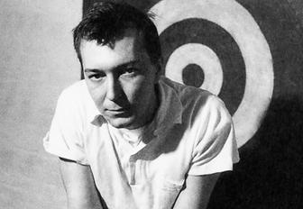 The National Gallery of Art's new exhibit, Jasper Johns: An Allegory of Painting, 1955-1965, takes a focused look at four themes in the artist's work during an important decade in American art. Johns is one of the giants of American painting, and the chance to look at this selection of paintings of sketches is welcome. Up close, one can see the process, the imprint of the painter, the thick and beautiful application of paint, and even read the yellowed strips of newspaper used in his encaustic-coated collage technique ("Chester Weddings of Interest" reads one headline in the 1961 Target). The luscious surfaces, the joy and comic touch make up for the general inscrutability of the sphinxian Johns.

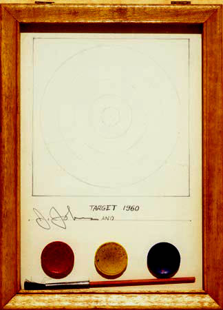
The first theme in the exhibit is the target, most familiar in an iconic Johns work, Target with Four Faces, from 1955, now in the collection of the Museum of Modern Art in New York. It is shown near its much less familiar twin from the same year, Target with Plaster Casts, now in the collection of record and movie producer David Geffen. In both cases a hinged panel opens at the top of the work to reveal casts of human body parts. In the version with four faces, these are casts of the artist's lower face, seeming to indicate that the rest of his body could be behind the target. While the four faces are in a nondescript brown, the various casts Johns made of his own body (foot, nipple, ear, penis, etc.) for the other version are brightly colored. The first level of the exhibit is filled with various versions of the target motif, worked out in sketches and other paintings. Johns makes clear that the motif had lost all meaning and became a gimmick, in his Do It Yourself (Target), from 1960, a little kit to make your own target painting, signed J. Johns and __________.
| Other Reviews: New York Times | Bloomberg News | Slate | Washington Post | Washington Times | Voice of America | Associated Press | Christian Science Monitor | New York Sun |
The second theme, which begins with works on the first floor, is the naming of colors, in which the words for colors, especially RED, YELLOW, and BLUE, are applied by stencil. This strikes me as a reference to the paint by numbers technique, except that often the actual colors Johns applies do not match their corresponding words, as in the most famous canvas in this group, False Start, from 1959. This is not always without cynical reference to abstract expressionism and the so-called color field painters. Out the Window, from 1959, if the colors matched the stencils, could look something like a Mark Rothko.
 On the upper floor, the exhibit shows works that use what Johns called "the device," usually a piece of wood attached to the canvas frame that could be used to scrape the paint on the surface in a circular shape. The motion of the device was somehow related to the swirling arms of American poet Hart Crane, who committed suicide by leaping into the Gulf of Mexico. Indeed, in two paintings shown in this exhibit -- Periscope (Hart Crane) and Hatteras, both from 1963 -- a hand and arm make the same circular swath as the device. These references to Crane, whose unhappiness with his own homosexuality may have led to his suicide, may be a rare autobiographical detail in the work of Jasper Johns, who was also gay. Whether the motif is an expression of sympathy or trivialization is not clear.
One of the most beautiful and somber pieces in the show is Diver, another Hart Crane-inspired work from 1962-63. A large canvas of mostly black and muted colors received the imprint of Johns's hands and feet -- the fourth theme in this exhibit -- in motions that recall the act of diving. The feet at the top of the canvas point toward the sky, and the hands begin at the bottom of the canvas, sweep upward in circles and end up at the center of the painting, alongside the diver's body, if he had a body. The curatorial text suggests a parallel with the Crucifixion, but Diver immediately reminded me of Leonardo's Vitruvian Man, an attempt to graph the proportions of despair.
All four themes highlighted in the show are present in two large paintings shown across from one another near the end of the exhibit, Diver (1962) and According to What. As Tyler Green has remarked at Modern Art Notes, the decision of curator Jeffrey Weiss to exclude the most prominent motifs associated with Johns -- flags and numbers -- means that the NGA exhibit does not tell the whole story. In particular, the connection between Johns and the work of René Magritte is explored in the Magritte show also on display right now at the Los Angeles County Museum of Art. The curators of the NGA exhibit acknowledge this deficit in their program, stating that their four lesser-known themes, illustrated by a series of beautiful paintings, are part of "an effort at de-familiarization."
All images © Jasper Johns, courtesy of National Gallery of Art, Washington, D.C.
Jasper Johns: An Allegory of Painting, 1955-1965 continues through April 29. Admission to the National Gallery of Art is free.


5 comments:
Looking forward to this show. The, Diver, looks especially interesting.
An alternative take on the Jasper Johns exhibit not to be found in corporate media: "It’s not a happy accident that the first image seen at the Jasper Johns show is a corporate logo that echoes the artist’s most celebrated series of paintings - blurring the distinction between advertising and fine art. No doubt the Target corporation is taking advantage of, and contributing to, the commercialization of culture."
www.art-for-a-change.com/blog/2007/02/jasper-johns-target-with-body-parts.html
I can be pretty cynical anon, BUT, I don't think anyone at Target is that gifted.
Dear Mark (Vallen, not Barry),
This is an interesting point, of which I was not unaware. As I see it, Johns himself voided the meaning of the target image. Given that context, any number of meanings, even one related to advertising, could attach to it. By funding the exhibit, the company is doing something good, of course, let us not forget.
I did not see any reason to mention the corporate tie-in, giving the company free advertising, so I left it out of my review. Ironically, by drawing attention to the corporate sponsorship of the exhibit, aren't you actually helping the company in question?
Hi - Glad to see so much talk going on about this painting , it's one of my absolute favorites. I really liked the idea about Leonardo's Vitruvian Man, the cruxifixion analogy comes up too quickly, I think, and few are caught long enough to stare deeper. I long to traces those outlines with my own feet and hands , I've been that diver many times. the painting is despairing and peaceful at the same time
Okay , anyone know the poem or the poet that is on the wall right next to this painting at MOMA NYC. It was suppossedly to have inspired Mr. Johns. I've lost this little gem and google searchs are not bringing it up.
Thanks for the chat , art friends, hopefully one of you will be bring back my treasure.
Colleen Andersen
Post a Comment